
May 03 2023 – Lindsey Neill

HOW TO - Choosing Colors for a Quilt

Selecting fabrics for a quilt can be a daunting task. Today I'm sharing my method for simplifying the process!
I'm using my most recently released pattern, Hello Spring, to demonstrate my method. You can purchase the Hello Spring pattern HERE.
STEP ONE: Examine the quilt

Before I decide on colors, I will first study the amount and placement of colors used in the cover version of the quilt. (If you're not a fan of the colors or overall balance in the cover version then I recommend going on social media and looking at the quilts or mock ups made under the pattern hashtag. Find your favorite and take a screenshot of it.)
Some questions I ask myself first is - How many colors are being used? Is there a specific color used in the example quilt that I want to use in my quilt? And, is there a lot contrast or variation between the colors or are they all similar in tone?
One way to determine the tonality of a quilt is to take a photo or screenshot of it and convert the image to black and white (I only removed the saturation in the photos below. I do not recommend using a black & white filter for this method. It can create more contrast between the colors than there actually is).
If the image has a lot of similar shades of gray then you'll want to pick colors that are also similar in tone. If the image has an obvious range of different grays then you'll also want to pick colors with a lot of contrast or variation. Examples of both are shown below.
 On the left is the Hello Spring cover quilt. The color palette, minus the background, is overall similar in tone. There is variation, but, compared to Sparrows on the right, there is significantly less contrast between the colors.
STEP TWO: Decide on colors
My favorite way to get inspiration for fabric pulls is on Pinterest. I think I have a pretty good instinct when it comes to color, but I'm definitely not an expert. I like to see what the professional palette makers of Pinterest come up with and draw inspiration from that.
I will search "color palette" on Pinterest or sometimes be even be more specific and search "color palette with 5 colors" or, if I'm loving a specfic color from the example quilt, "color palette with yellow". I'll scroll through the options and save any that I love. I then go through the ones I saved and narrow it down to a favorite. Again, because we are mimicking the tones in the example version, you'll also want to study the colors used in the palette. Are they similar in tone like the cover version, etc? Converting the color palette image to B&W might be useful in this step too.
The Hello Spring pattern (shown above on the left) uses 5 different colors for the blocks + 1 color for the background. To make things easy, I am leaving the background color the same and just focusing on the block colors.
Here is the color palette I found on Pinterest that I will be using in the new mock up.

(If you're not loving the options in your Pinterest feed, you might find my "Color Inspo" board helpful. You can check that out HERE.)
STEP THREE: Create your mock up
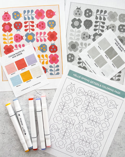
Compare the B&W image of the quilt and B&W image of the color palette and start matching the tones of each and applying them to the mock up. I personally use Adobe Illustrator to create my mock ups, but some other options to create mockups are the Recolor app, Quilt Mock-Up, or a good ol' fashioned coloring page and markers/colored pencils.
Download the Hello Spring coloring pages HERE!
Ultimately I want the colors within the quilt to look good so, while matching up the tones can take some of the guess work out, if two colors that aren't complimentary are next to each other I will either swap one of them for a different color in the palette or change the tone/hue of one of the colors until I'm 100% happy.
There is definitely some trial and error, but I think it's so helpful to have as accurate of a mockup as possible to avoid have to redo blocks or change out fabrics while making your quilt later.
STEP FOUR: Match colors with fabric swatches

Once my mock up has been made, I'll then start matching the colors with fabric swatches. For more accurate color matching, I recommend ordering solid swatch cards or booklets from your favorite fabric manufacturer. A lot of quilt shops will sell them. As we've all experienced, the fabric color you see on your device can look entirely different in person so it's very helpful to have actual swatches to reference for this step.
My favorite solids to sew with are Robert Kaufman's Kona solids. To get the most accurate color representation in my quilt I'll sometimes mix fabric manufacturer's. Ruby + Bee from Windham, Cotton Couture from Michael Miller, and Bella Solids from Moda also have a great variety of colors to pick from!

The solids I ended up using for this example are (Which are different than what I listed in my "Hello Spring Kona Mock Ups" blog post because I'm the most indecisive person ever 😅) Kona Quicksilver, Nectarine, Yarrow, Primrose, and Corsage. In full transparency, I might be swapping out Quicksilver for a different muted blue color. Again, Queen of Indecision 👑😆

Here is the new mock up and the original version in B&W, side-by-side. As you can see, I matched the tones between the two color palettes almost exactly, but made some adjustments with the hue/tone of the blue and purple colors to achieve better harmony/balance within the quilt.
Once you've figured out which solids best match the colors from your mock up, you can then order your fabric and move on to the fun part - Making your quilt!
Have a question? Email us at penandpaperpatterns@gmail.com
Tagged: hello spring, how to, kona, ladybug, mock ups, modern, new, new pattern, pattern, patterns, pen, pen and paper, pen and paper patterns, QAL, quilt, quilt along, quiltalong, sew along, sewalong, sewing, solids, tips, Tutorial
3 comments
Sooo interesting and inspiring to read about the different methods of choosing quilt colours!
I myself am more the sort of “happy chaos quilter” – so that, I grab into my stash, choose some fabrics which seem to fit perfect to the season or the day or whatever, look after some patterns I had collected – and start to cut and sew.
Very often it happens that, the finished quilt looks totally different to what I ’d planned first but, it makes me happy to change and add colours and patterns – quilting is my therapy😏😏🙋🏻♀️
I am a retired quilting teacher. My methods for choosing colors are more simplified and do not require Pinterest, Adobe, etc.
I would often ask the student to walk around the quilt shop and find a fabric that ‘spoke’ to her with colors that made her heart sing. Look at the selvage. There you will find ‘dots’ of each color used in the printing process. Those are the colors you are looking to replicate. You do not ‘need’ to use that fabric, however, it might make an excellent border for your quilt.
This also works using colors from a favorite artwork.
Designers and artists are well trained. Use their expertise and experience!
Now, look at the light and dark ‘values’ of the colors you have selected. Squint your eyes. I like to use ‘Ruby Beholder’ or red plastic sheet to eliminate the ‘color’ to see just the values. Kids red sunglasses work, too. This will not work well for the ‘red’ color, however.
https://learnhowtoquilt.com/encyclopedia/ruby-beholder/
Which colors/values do you want to dominate?
Which colors/values will be the accent?
Which colors/values repeat in the design and lead the viewer’s eye around the quilt?
Which colors/values accent the design and make it ‘pop’?
I like to refer to the traditional Color Wheel … split complimentary or complimentary, etc.
https://stock.adobe.com/search?k=color+wheel+chart&asset_id=475661479
So interesting and methodical! Love your options that you provide 😊